While the science behind how movies use color to create emotion is quite complicated, it is certain that humans will have instinctive reactions when being exposed to specific colors. Filmmakers have been using this to their advantage ever since the beginning of film history, which means that colors in movies are often taken into specific consideration to ensure that the viewer is put into a certain emotional state. With streaming services today trying to reduce churn, it has become more important to make sure the user can quickly find the content they would be interested in consuming. With new technological advances, such as Vionlabs’ AI-driven Emotional Fingerprint API, OTT services will now be able to ensure that Lisa, who enjoys spending her evenings winding down with quirky lighthearted content and prefers to have her morning coffee with intense horror stories, can be presented with the right content at the right time. To further examine how OTT services can benefit from a deeper understanding of color’s effect on emotion and how this can be used to connect with the user base, let’s dive deeper into the topic of color in motion pictures and how filmmakers use it as one of the cornerstones of creating great cinematic emotional experiences. 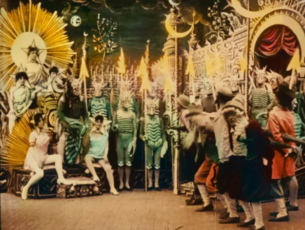 A Trip To The Moon (1902)
Color Through Film History
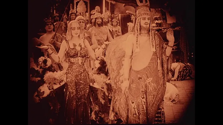
You might think that how movies use color to create emotion in motion pictures as something of a later invention, but it has actually been around ever since the beginning of film history. While the earliest motion picture stocks were orthochromatic and thus unable to record red light, most early films created artificial coloring by using aniline dyes. George Méliès A Trip to The Moon (Méliès, 1902) went through the tedious process of being hand-colored. Méliès had each frame tinted and painted by twenty-one women using a production-line method.n
Intolerance (1916) Other early methods included using stencils, as well as film tinting. There, black-and-white film strips were soaked in dyes in order to stain the emulsion, creating a color where white light would have otherwise come through. Filmmaker D.W. Griffith showcased a huge interest in color and used this for some of his films like The Birth of A Nation (Griffith, 1915) and Intolerance (Griffith, 1916). Intolerance, which is regarded as one of the silent era’s great masterpieces, consists of four different, but parallel storylines, each tinted with its own color, illustrating the intolerance of humankind and its persistence throughout the ages. Here, color provides a temporal context, ensuring the audience understands when and where something is taking place.n
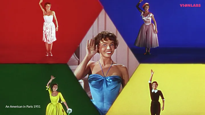
An American in Paris (1951) The most widely used Hollywood color process between 1922 to 1952 was Technicolor. By using several strips of film, each with its own color and then superimposing them on top of each other, the filmmaker was able to reach the colorful, vibrant results seen in movies such as The Wizard of Oz (Fleming, 1939) and the extravagant musicals of the 40s and 50s, such as An American In Paris (Minnelli, 1951) and Funny Face (Donen, 1957). In 2000, new possibilities were realized in film coloring when digital coloring was first used in the motion picture O Brother Where Art Thou (Coen Brothers, 2000). There, the Coen Brothers were able to change a green summery landscape into the sepia-toned environment we know so well from the movie. With the opportunity to change the color digitally, filmmakers now have the possibility to really turn color into its own character in the story.
The Components of Colorn
To be able to fully understand and measure color and its use in movies, one must first take a look at its main components. Any color will feature the following three: Hue, Saturation and Value.n
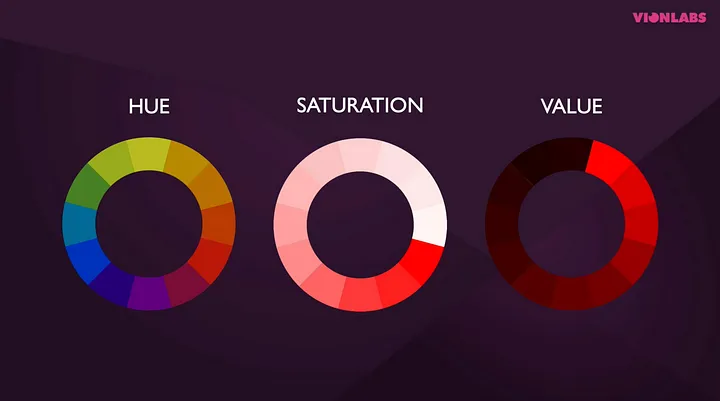
Hue is what we would call the actual color found on the pure color spectrum, usually demonstrated in a rainbow wheel and ranging from red to green to violet. Saturation The color saturation tells us how intense a color is. The color can be strong and vibrant, or faded and watered-down. A fully saturated color is considered to be its truest or most pure version. Value The color value describes a color’s lightness or darkness. Adding white to a hue will leave us with a high-value color, otherwise referred to as a tint. Meanwhile, if you add black to your hue this will result in a lower-value color, also known as a shade.
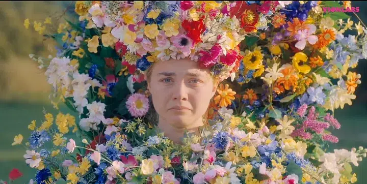
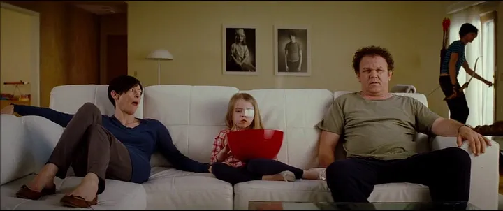
Midsommar (2019) The filmmaker can play with these components to change the look and feel of his film. In the film Midsommar (Aster, 2019), desaturated and overexposed shots contribute to the overall dreamlike feel of the film. Read our article about the movie Midsummer here These aspects can be measured, together with other variables of a film, to create a movie’s custom emotional fingerprint. Such data can be used by OTT services to make sure the right type of content is presented to the viewer at an optimal time. The more knowledge an OTT service has of its viewers and in turn, what kind of emotional states they enjoy in the content they consume, the more opportunities are there to reduce churn. By comparing one fingerprint with another it is now easier to present the user with similar content to what they already enjoy.
How Color Is Used In Movies
Color is a key aspect of cinematic expression, whether it be to represent a certain emotion and its intensity, to make your main actress stand out or to highlight certain details for a stronger emotional impact. nhttps://www.youtube.com/watch?v=-S7UInq8cRQ
Representing concepts and characters with color
Colors are already deeply connected to the various feelings, moods, or aspects of our world and by attaching them to certain key features in a cinematic universe, they come to represent certain concepts and characters. One common example of this is using color to represent a feeling or emotional state. Depending on the context, red can be used to represent aggression, violence, and anger, as well as love and passion. Whilst a color such as purple can be seen representing the mystical, or sometimes death and delusion. Color can be used in this way to help tell the story and plays a huge part in making sure you will feel the way the filmmaker intends you to.n
We Need To Talk About Kevin (2011) In We Need To Talk About Kevin (Ramsay, 2011) the color red is used to represent the blood and the violence we are never directly confronted with, while in American Beauty (Mendes, 1999) the same color represents Lester’s deep infatuation with his daughter’s friend, Angela. Each film presents its own cinematic color scheme, dependent on the story, so while the color green in one world might be associated with envy, in another it could represent abundance, nature, or paradise. The story defines its use of color and with this the filmmaker can intensify what we see on screen while creating the film or the scene’s overall mood.n
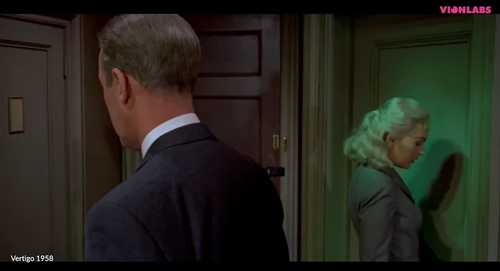
Vertigo (1958) Secondly, color can be used to represent a certain character, like in Vertigo (Hitchcock, 1958) where Scottie’s mysterious love interest, Madeleine, is represented by the color green. Leading up to the movie’s climax the color becomes more pervasive and signifies Scottie’s obsession with Madeleine growing stronger. In the movie Blue is The Warmest Colour (Kechiche, 2013) it is quite the opposite. Although the color blue is featured everywhere throughout the story, it starts off as intense and grows progressively paler as the love between the characters fades.
The orange and teal color scheme
Colors can also be used to make certain features stand out. Maybe you have already noticed that most movies utilize the famous orange and teal color schemes. Why? For one it makes the actor stand out. If you have locked down the gorgeous Scarlett Johansson for your film, you would want to be sure her face is the thing people notice, right?
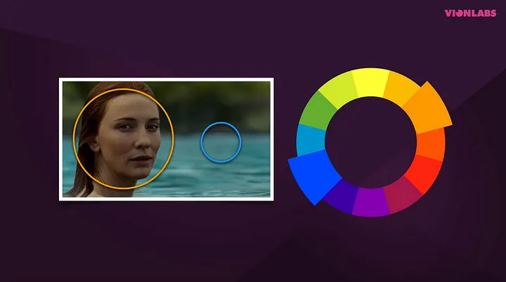
Most skin tones in films fall within the orange shade on the color wheel, and upon closer examination, you can see that blue is placed opposite orange. The two opposing colors are said to complement each other, resulting in the orange hue becoming more noticeable to your eye. While a color such as red holds different meanings depending on your cultural standpoint, orange and teal do not — making them a better hit all across the globe.
Highlighting details for emotional impact
Color can also alert the viewer on where important clues can be found in a frame. When it’s used to guide what the audience is supposed to see, the feelings already presented in the scene can be magnified. A red balloon will provide extra tension and help send shivers up our spines if it happens to be associated with a creepy clown devouring our local community’s children.n
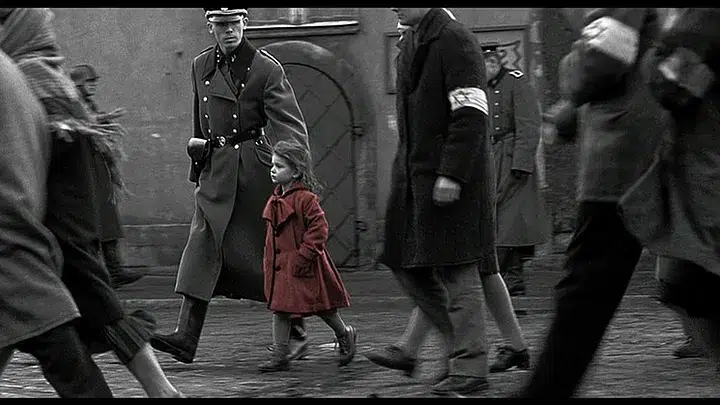
Schindler’s List (1993) We remember the little girl in the red jacket in Schindler’s List (Spielberg, 1993) so clearly because it had an emotional impact on us. In fact, in our memory, it is likely that the red in that shot is even more vibrant than actually presented in the film itself. With the use of this one color, Spielberg brought detail to our attention that otherwise might have been lost. A detail that when seen clearly creates a huge emotional impact. We wonder what will happen to that little girl and what suffering she has and will have to withstand.
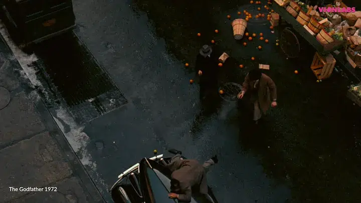
The Godfather (1972) In other contexts, color can be used to send out warning signs, like in The Godfather (Coppola, 1972) where the color orange is closely followed by the immense threat of death. Although Coppola has admitted that the use of orange in the first Godfather film was a mere coincidence to contrast the otherwise quite dark theme of the movie, the orange itself came to have an emotional impact and was thus used with intent in the follow-ups.
Auteurs and their color palettes
Some auteurs are known for using colors that reappear throughout all of their work. In Wes Anderson’s movies, the color palette has a lower saturation, resulting in a pastel look that contributes to the quirky universes we are so familiar with in his stories. His colors feel light, bright, and not overly serious, which is reflected all throughout his filmography. You know that when you sit down to watch a Wes Anderson movie, you will be presented with a quirky and enjoyable universe full of characters that you do not have to take all too seriously.n
The Grand Budapest Hotel (2014) Pedro Almodóvar, with his extensive repertoire of Spanish melodramatic titles filled with violence, sex, and strong female characters, presents us with mise-en-scénes full of intense shades of blue and red. The emotion you experience during an Almodóvar creation reflects that intensity.n
How Clever Machine Learning Can Be Used to Capture Emotional Color Data
Seeing as color can contribute so intensely to a film’s emotional impact, the industry can use this to keep the consumer engaged and continuously interested in what they are consuming on different platforms. With the ability to measure variables such as color, you can gain a deeper understanding of user behavior, and Vionlabs’ machine learning-driven Emotion Fingerprint API accomplishes precisely this.
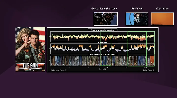
The Emotional Fingerprint API provides a deeper analysis by measuring thousands of factors in a film, including colors, pace, audio, object recognition, and much more. These factors are distilled by AI into a fingerprint that encodes the emotional structure of the content. With this data, the industry has new tools to empower its decision-making. OTT services can now analyze their content and make better-informed decisions about which users would be most likely to enjoy it. Originally published here: https://medium.com/vionlabs-tech-blog/how-movies-use-color-to-create-emotion-36226e31067d